Thumbnail Psychology: The Visual Science of Getting the Click
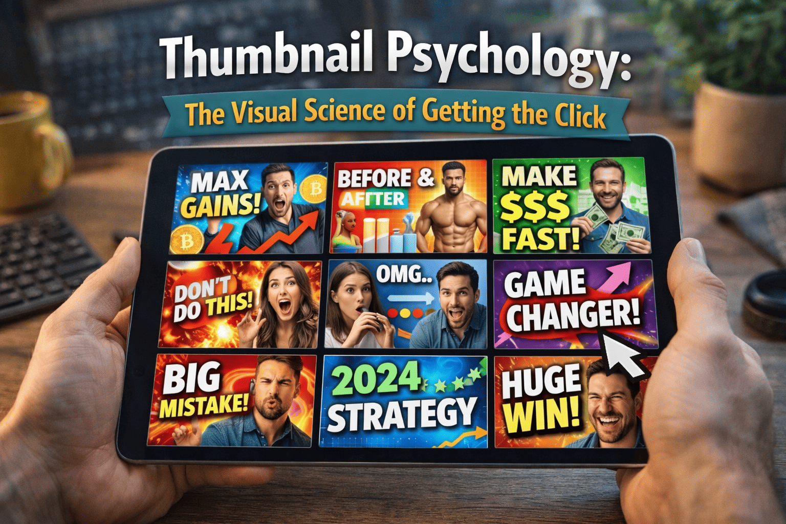
A thumbnail's only job is to create a "Cognitive Gap"—a mental itch that the viewer can only scratch by clicking. To do this, you must move beyond "pretty pictures" and toward Visual Engineering.
Phase 1: The Biology of the Scroll (Pre-Attentive Processing)
Before a viewer consciously thinks about your video, their brain has already decided whether to ignore it. Humans process images in roughly 13 milliseconds.
1. The "Contrast" Trigger
- The Workflow: Use colors that are opposite to the platform’s interface. Since YouTube is primarily white and dark gray, use vibrant reds, yellows, or "Safety Orange."
- The "Blur Test": Squint your eyes until the screen is blurry. If you cannot tell what your thumbnail is about while it is blurry, it will fail on a mobile screen.
2. The Facial Recognition Bias
- The Action: If using a face, ensure the eyes are visible and looking directly "at" the viewer or at the "Object of Interest."
- The Emotion Rule: Use "High-Arousal" emotions (Shock, Fear, Intense Joy). Neutral faces are invisible to the scroll.
Phase 2: Compositional Architecture
How you arrange elements determines the "Story" the thumbnail tells in a split second.
1. The Rule of Thirds & The "F-Pattern"
- Placement: Place your "Hero" (Subject) on the right side. We read from left to right; placing the face on the right allows the viewer to read the "Problem" (Text/Graphic) first and see the "Reaction" second.
2. The "3-Element" Maximum
A cluttered thumbnail is a low-CTR thumbnail. Your brain can only process about three distinct visual elements under high-speed scrolling.
- Element 1: The Subject (The Person).
- Element 2: The Object (The Thing being discussed).
- Element 3: The Context (The Background or a small text callout).
Phase 3: The "Text-to-Visual" Synergy
The most common mistake is repeating the Video Title inside the Thumbnail. This is wasted space.
1. The "Extension" Strategy
The thumbnail should show the Emotion; the title should explain the Logic.
- Good Synergy Example: Title: "How to Edit 2x Faster" | Thumbnail Text: "STOP DOING THIS."
2. Typography for Mobile
- The Manual Step: Use thick, sans-serif fonts (like Impact, Montserrat, or Bebas Neue).
- The Stroke/Shadow Rule: Always add a thick black "Stroke" (outline) or a "Drop Shadow" to your text for readability against any background.
Phase 4: Data-Driven Optimization Workflow
Once the thumbnail is live, you must use analytics to "Audit" its performance.
1. The 24-Hour CTR Pivot
- The Metric: If your CTR is below 4%, but your "Average View Duration" is high, the video is good but the thumbnail is failing.
- The Action: Change the thumbnail immediately. YouTube’s algorithm will "re-sample" the video to a new audience.
2. A/B Testing Strategy
Test two different psychological triggers to see what resonates:
- Thumbnail A (Curiosity): "I found this..." (Subject looking at a blurred box).
- Thumbnail B (Authority): "The Best way to..." (Subject holding a high-end tool).